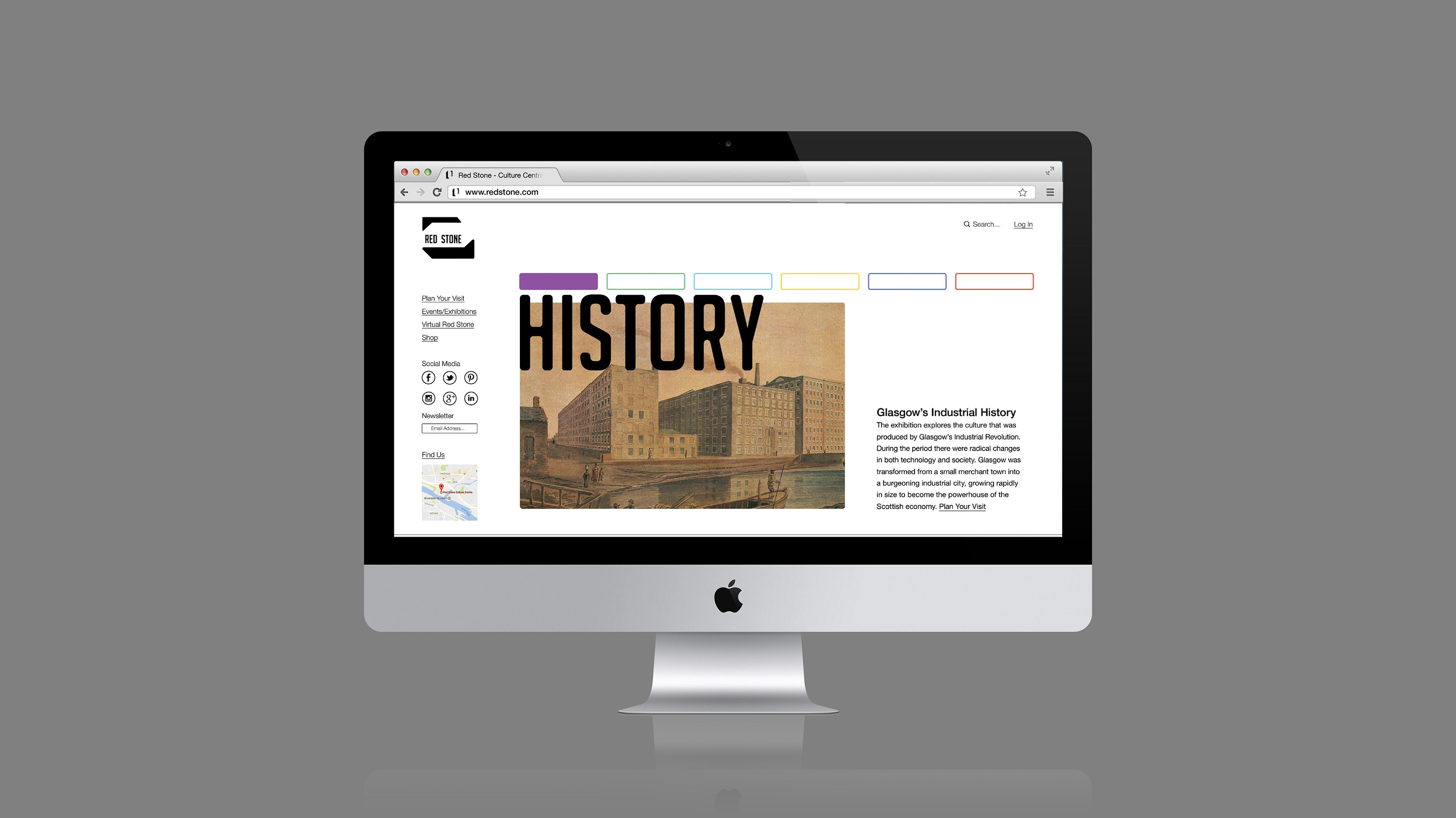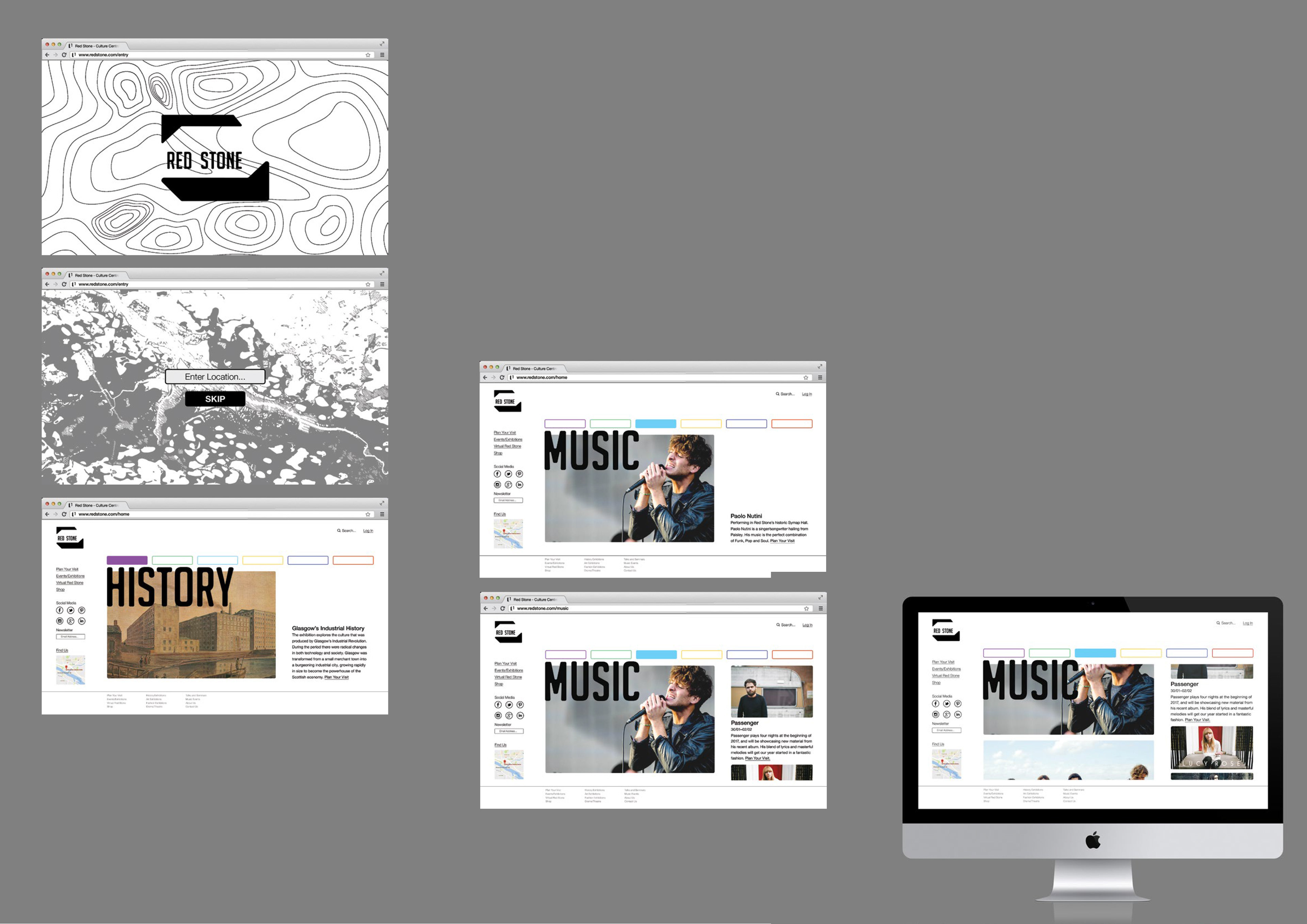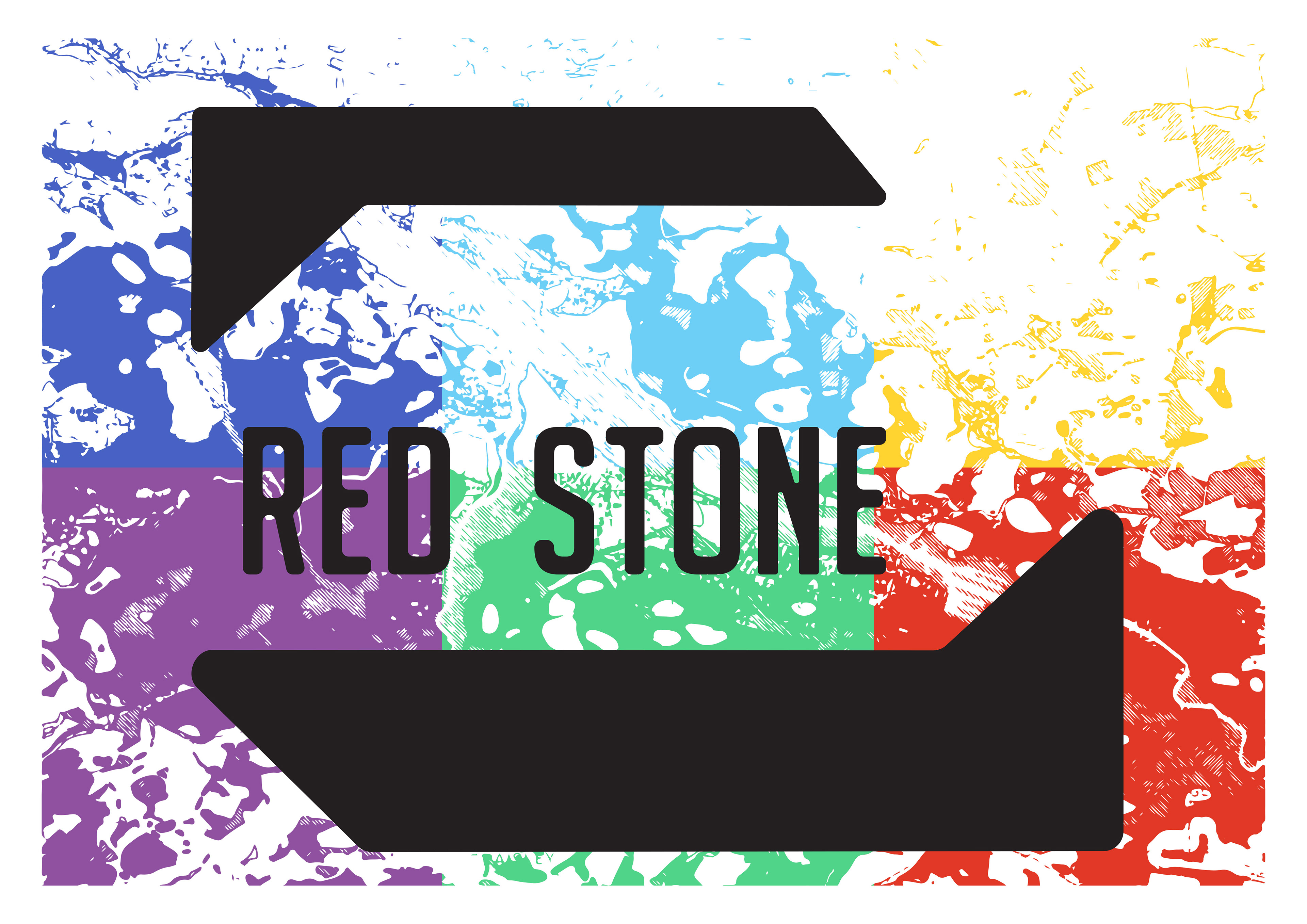
Branding a culture centre in Glasgow that has been designed by the architecture firm C.F. Möller. When developing the visual identity and assets for Red Stone I was inspired by two main things, the architect’s ethos of using local materials to build and that the Red Stone identity should breed a culture of discussion and exploration. The Red Stone identity uses maps to show the important relationship between the culture and the environment. Our culture is dictated by the environment, shown by Glasgow’s fashion culture being a by-product of trade with America coming in on the River Clyde.
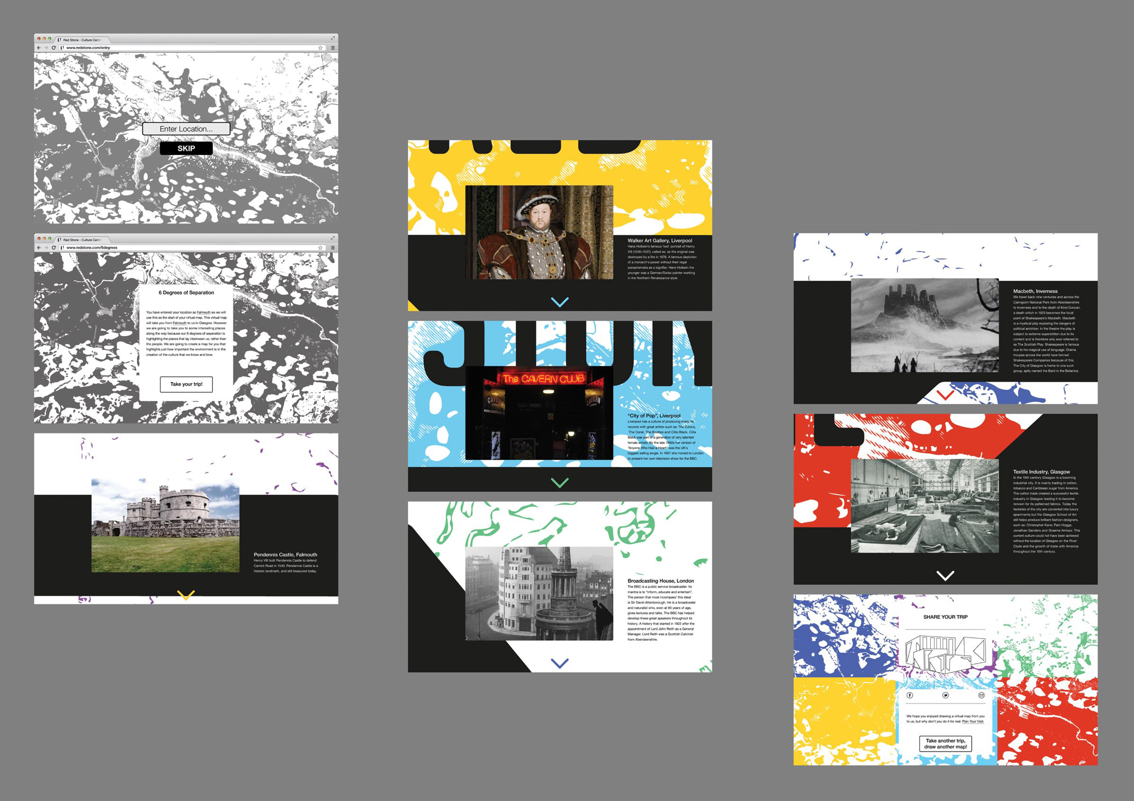
Maps are the perfect reflection of the relationship I discuss above as they let people affect the environment, just as the environment effects us and our culture. I use maps for the visuals, but also in the digital application I explore idea of virtual mapping through 6 degrees of separation. I use the locations, rather than the people, to map the different locations and culture that link users and Red Stone.